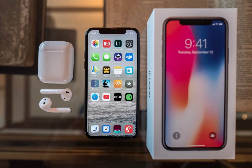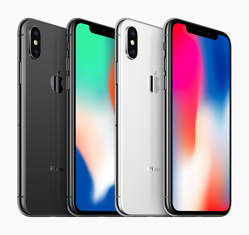
It’s been a year again and I know I’m late to the iPhone X (pronounced 10 as the Roman numeral X) review party. This is the first iPhone in 10 years that I didn’t get on release day. I ordered my iPhone X 256GB Black after midnight Pacific time on Friday October 27th. But my ship date was immediately given as November 17th – November 24th (2 weeks after the first shipment). I received it last week a few days before November 14th. With that out of the way let’s move on to the review.
How great! It’s hard to believe it’s been 10 years since the first iPhone. I do a review every year and it’s fun to go back over the years and see how much has changed. If you’re feeling nostalgic, you can check out my first iPhone review here. While a lot has changed since 2007 and many versions of the iPhone (such as the “s” models) have evolved. The iPhone X feels like a brand new iPhone. This is the first iPhone in 10 years to ditch the home button, and it might surprise you
I don’t miss the iPhone home button
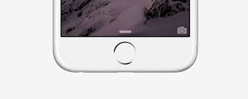
iPhones have changed in size, features and quality over the years. But one thing has remained consistent and that is the home button. The physical button that will always return you to the home screen no matter what app you’re in or what you’re doing. The home button on iPhone X has been replaced by a swipe up gesture from the bottom. It takes about a minute to use. I was apprehensive about some of the things that changed with the iPhone X. The home button was probably the one I thought I’d miss the most. And honestly, it’s probably the easiest change. Swipe up from the bottom and you’re home.
Grooves are not attractive
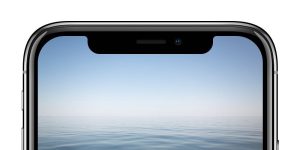
I’m a huge fan of aesthetics and while I’m not a fan of the “notch” at the top of the iPhone X screen. It doesn’t bother me as much as I thought it would. I’m not giving Apple a pass on this one because I think Jony Ive could have done better. Granted it doesn’t bother me to the point of wanting my iPhone 7 Plus back. Apps that have been updated to work with the new display on the iPhone X do a good job of integrating the notch. So it’s not a distraction. Apps that haven’t been updated yet appear smaller on the iPhone X display. This bugs me more than the groove itself. Why a groove? The notch is actually the area that houses the front-facing camera, sensors, and microphone. Those things have to go somewhere and you’ll have a notch if you want and go from edge to edge of the screen. I’m just not sure if the screen should go to the top edge?
I miss the battery percentage the most!
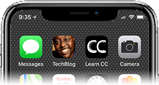
Because of the iPhone X’s notch at the top. Apple decided that on the left you see the current time and location icon. And on the right you see your cellular signal strength, WiFi icon, and battery icon. Alas the battery percentage is gone from this display.
You can find it by swiping down from the top right of the notch on top of Control Center. Representing my battery level graphically is much less useful. Than seeing the actual percentage. I wish Apple would allow us to choose a preference. That swaps the battery icon display for a percentage display. While you’re at it in the app, why not let us customize which pieces of information appear on either side of the notch. That way everyone sees the information most useful to them. It will be an easy update on iOS. The battery icon is almost useless compared to the actual percentage.
Another odd omission is that you can’t rotate the home screen on iPhone X, unlike iPhone Plus devices. I don’t think this is a technical limitation as iPhone X has the fastest and most capable processor. So why would Apple remove this feature from the iPhone X?
I love the new form factor
The iPhone X Plus is smaller than other iPhones (like the iPhone 7 Plus). I welcome this change because when Apple introduced the larger plus-size models starting with the iPhone 6 Plus. I wanted a larger display but not a larger one. The iPhone X’s display is slightly larger than the iPhone 7 Plus, but the overall phone is much smaller. It’s a perfect form factor for me because it fits in my pocket and hand just as well and I can keep my big display. It’s a perfect form factor for those who like the idea of a big screen but never want a big plus-sized iPhone.
Camera
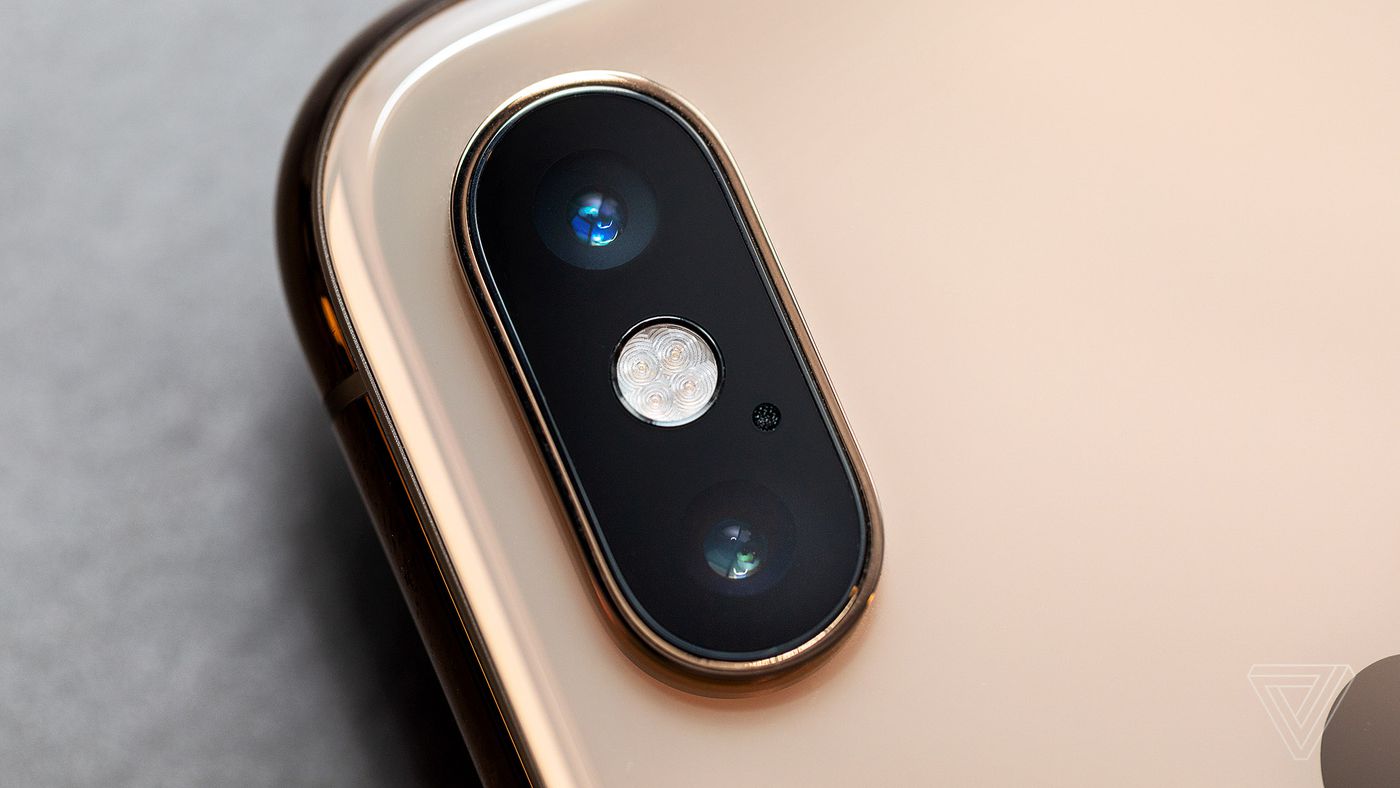
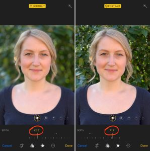
After 10 years, one of the main things I look forward to in a new iPhone is an improved camera. The iPhone X’s camera does not disappoint. If you’re a mobile photographer, the new shooting modes on iPhone X and iPhone 8/8 Plus alone are worth the upgrade. Images are sharper and low-light photos are improved Perhaps. The biggest improvement is the addition of all the above shooting modes to the selfie camera.
Also if you shoot video iPhone X is now capable of 4K shooting at 60fps. Speaking of videos, I have another iOS feature request. It would be great if we could choose one of the video formats in the camera app instead of going to settings to do it.
FaceID Just Works!
Another iPhone X feature I was a little skeptical. And apprehensive about was the new FaceID 3D scanner. Since there is no home button, Touch ID (fingerprint sensor) is not possible. Touch ID has been replaced by Face ID on iPhone X When I set it up I did it without my glasses. Of all the iPhone X features, this one probably impresses me the most. I don’t miss Touch ID at all. This only works for me when I’m holding the iPhone X very close or I’m not looking at the phone (you have to be “present”). Otherwise it works every single time. I’d say it works just as well if not better than Touch ID. It’s also easier than leaving your finger on the home button on previous. iPhones when switching between apps that can use FaceID.
Is it fast and what about the OLED display?
It’s funny when people ask me if it’s fast? I would guess that it is, but to be honest it’s been a long time since I’ve had an iPhone that felt slow. I don’t notice any significant speed increase. Because I usually don’t have to wait for anything to happen on my iPhone. I rendered a video in one of my apps and it seems faster but then again it was already pretty fast. As far as the OLED display is concerned yes it is beautiful, bright, technique sharp and crystal clear. My photos look great on it, but then again they didn’t look bad on my iPhone 7 Plus. Is it good? probably Is it better night and day? Not that I can see with my naked eyes. Everything happens and refreshes instantly. It’s beautiful!
Some gestures you’ll need to know
They don,t have any home button. you’ll have to learn a few new gestures combinations to do things you used to do with the home button. The most obvious one is going to the home page. Just swipe up from the bottom.
Taking screenshots – I take screenshots every day. This was one of the first new things I had to learn. Now instead of holding down the power button. The home button you press the power button and the up volume button simultaneously.
Using Apple Pay – Double tap the Power button.
Using Siri – Hold down the power button or enable “Hey Sir” in the Settings app.
Switching apps – Start swiping up from the bottom of the screen pause to bring up the app switcher.
Quitting Apps – This is a weird one because it requires an extra step that I can’t for the life of me figure out why. Start swiping up from the bottom of the screen pause to bring up the app switcher. Now press and hold on any running app and the minus sign will appear (not sure why Apple added this step). Once the minus sign appears you can either tap on the minus sign or swipe on the apps you want to close.
Returning to the first home page – If you have swiped several pages in the app and want to return to the first home page, swipe up from the bottom.
My favorite iPhone X accessories so far
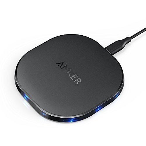
Whenever the iPhone’s form factor changes, It usually means buying at least one new case. Yet, not only did I need a new case for the iPhone X, I also wanted a wireless charger. I started with Apple’s brown leather case for the iPhone X. I like it. But I’ll probably test different areas in the coming weeks and months.
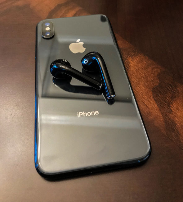
While AirPods are certainly not new, they are definitely my favorite wireless earbuds. My only complaint is that they only come in one color (white). Luckily the good folks at blackpods. Store will either sell you a black set like the one I bought above or your drawings.
The Bottom Line
If you’ve been waiting for a true upgrade from your previous iPhone, this is it! I also didn’t consider the iPhone 8/8 Plus because they are incremental upgrades from the iPhone 7/7 Plus. To be honest, if it wasn’t for the iPhone X, we all know that what Apple chose to call. The iPhone 8 would have been called the iPhone 7s. The iPhone X is a new design from the ground up. It has all the latest and greatest technology inside and so far (it’s been a few days for me) it works really well. I’m glad I skipped the iPhone 8 Plus because it’s the iPhone I really wanted. It was worth the wait.
Yes there are some of the things I mentioned above that have me scratching my head. But aside from the “notch”, few of my complaints are easily rectified in iOS if Apple chooses to do so. The hardware is great! If your budget allows for it, don’t hesitate, go for the iPhone X. If you’re using an iPhone 7/7 Plus and don’t want. The iPhone X, I’d probably wait for the next upgrade. Hmmm, what about the iPhone 8S or Will the iPhone 9? If you’re on an iPhone 6 or 6s device, it’s worth upgrading to an iPhone 8 or iPhone X device. I am happy with the iPhone X and yes I would do it again.
Finally, should you get Apple Care+ with the iPhone X? Yes! I don’t usually get Apple Care+ for my iPhone because I rarely break them. But, the repair cost of an iPhone X ($279 for screen replacement and $549 for other damage – OUCH!) is much higher than previous models. So AppleCare+ is a safe bet.

